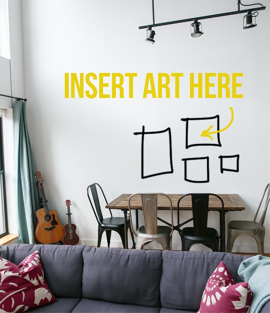
Our new dining table is finally broken in (we hosted our first 6 person gathering last month, a feat our old 4-seater table could not even begin to accommodate). However, despite having lived in the same place for 6 1/2 years, the blank walls that now surround the new table make it feel like we just moved in yesterday.
We need some art, and we need it, stat.
Problem is, we can’t decide. Do we go with one giant piece of art (our extra-tall walls could most definitely support something oversized), or do we cobble a few unique pieces together for a collage-like effect? Stretched canvas or frames, and matching frames or mis-matched? Times like these I wish I was an interior designer and didn’t waffle so much with such decisions.
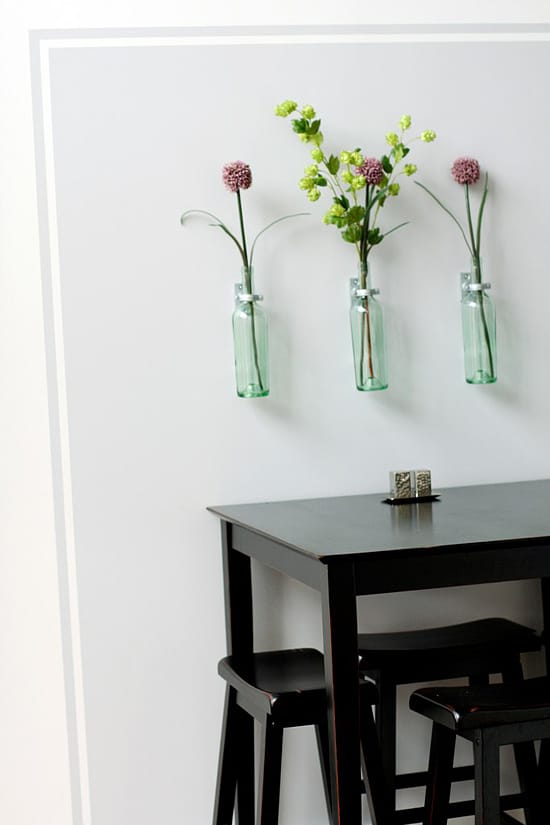
Our old dining “room” had a big painted square on the wall, which defined the space and served as a backdrop for some DIY wine bottle art. Which was awesome. And we loved it, but after 6 years of the same thing we needed a change.
Plus, our new reclaimed-wood dining table (this one from Restoration Hardware) was longer and didn’t fit in the square. As painful as it was to paint over, knowing how much time we spent tediously measuring, taping, and painting pristine edges on that darn square, the clean white wall was a refreshing change. Until we realized just how boring that wall was and our need for art became even more urgent.
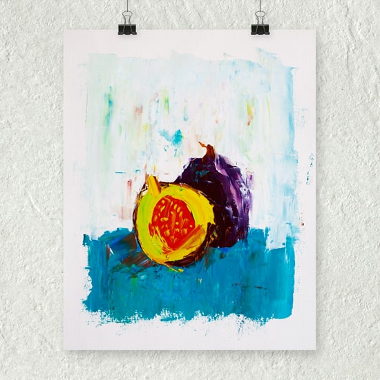
Sometimes, art just happens to you when you aren’t even looking.
When I saw this fig painting, I didn’t think twice about buying it. I love that it’s an original, not a print, and yet miraculously still affordable. Sorry, but I’m not one to spend thousands of dollars on art (I value fine art, I truly do, but I’m just not in a place to justify purchasing such things for myself). Oh and by the way, the artist, Eric Buchmann, has some other foodie-friendly pieces on Artfinder, including passion fruit (OMG) and pomegranates, just in case you were interested in owning one yourself. :)
The problem with the fig was its size, 11×14 would look rather pathetic hanging by itself on our rather large dining room wall. So I expanded my art search, finding an amazing and unique treasure trove of art over at Minted. I’m sure you, like me, thought of Minted as holiday cards and wedding invitations, but it turns out they have an amazing selection of limited edition art prints too.
Would you believe me if I said I probably spent three entire days (not all at once, of course) narrowing it down this far? I’m sure I’m well on my way to carpal tunnel by now after scrolling (and scrolling) through endless pages of art.
I’m indecisive like that, but when I get obsessed with something, I don’t care how stiff my wrist gets, I’m determined to see it through.
And yet, the more I scrolled, the worse it got. I had upwards of 50 pieces of art marked as a favorite before long. And while our empty wall is quite large, I daresay it’s not big enough to fit THAT much art.
So rather than continue my endless death-scroll, I figured I should set some criteria. The best way to start narrowing down choices was to first create an arrangement for the wall, and then find art that fit within that arrangement. That seemed more reasonable than doing it the other way around.
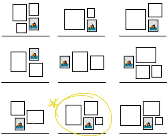
Based on the approximate size of the fig painting (once we get it framed) and the available art sizes on Minted, we came up with a few possible arrangements for 3 or 4 pieces. The bottom middle and right were the ultimate winners, the middle our final choice because of the large vertical frame that worked better proportion-wise with our favorite pieces than a square.
That’s where you come in. Help?
Note that we’ll likely be changing out the pillows, rug, and curtains to something a bit more neutral (gasp – dare I say, we’re maturing in our tastes?) and so are trying not to base our art decisions off of those replaceable pieces. Rather, we want to get art we know we’ll love, and then make our color/decor choices based on that.
Heads up: this post contains affiliate links and I will receive a small commission if you make a purchase after clicking one of them. All opinions are purely my own. Thank you in advance for supporting L&OO!
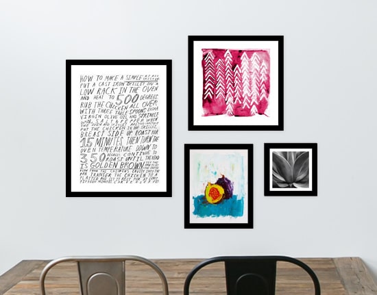
Option #1 (from left to right, largest to smallest): Roast Chicken (um, if we get this one I will MOST DEFINITELY have to test out the recipe), Northern Flow, California Succulent
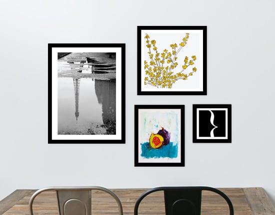
Option #2: Eiffel Tower in the Rain (did I mention we’re planning a trip to Paris this spring? Obv we’ve got croissants on the brain), Forsythia, Glyphs Modern (once a font nerd, always a font nerd)
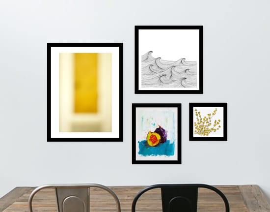
Option #3: Ode to Rothko I, Drift, Forsythia
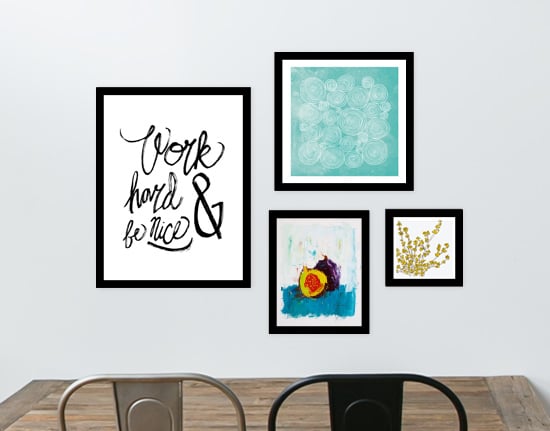
Option #4: Nice Work, Concentric, Forsythia
So?
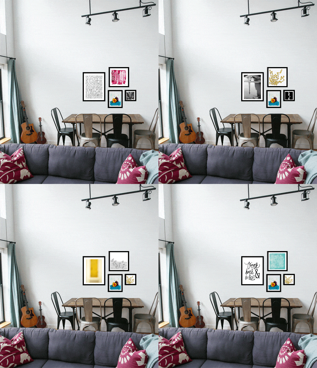
Which would you choose?
Follow up: matching frames, or mismatched frames? (Gah, more decisions!) Someone please take away my photoshop privileges before I start making more mockups.
Option 1!
How fun! My favorite arrangement is the first. I’m just drawn to that pop of red/berry. Also, the “Roast Chicken” print is just the perfect reflection of your culinary talents! Can’t wait to see the final look.
1 & 4 are my favorites :) they’re very cohesive as a group. I’d say matched frames to let the art speak for itself since they’re such great pieces!
I’m seriously feeling #3. I love the yellow pop in the Rothko (plus Rothko is just amazing) and those colors are so friendly. For something a little more neutral, #4 is nice with all the shades of blue that could kickstart some decor ideas. But no matter what, I think you’re going to need that Glyphs Modern print. Font nerds unite!
I like 3 & 4. I don’t like the frame, maybe a raspberry color or a box frame.
Definitely a fourth option! The best :)
I think I like Option #1 the best :)
I love the fig painting. Options number 1 and 4 are my fav
I really like #3. The colors really pop together and I like the feeling of that combination.
I liked #1 until I saw the gif and now I like #3 best. But I’d swap out the Forsythia for the Glyphs Modern.
I love this post! I just bought a place and am so stuck as to how to decorate. I love how you approached finding art for your kitchen. My favorite option was #3. I like the balance of color and natural elements, plus the wave painting kind of reminded me of the peaks of meringue on lemon meringue pie, which complements the yellow in the other 2 paintings nicely.
I vote for #2. I can’t tell you why, exactly, but it calls to me.
Buy a painting!!! Check out mine, they’d be perfect for your space and color scheme!
You do have some really lovely paintings. Great work!
I like #4 BUT with Roast Chicken swapped in for the one on the R.
And I have some HUGE blank walls that I’m just stumped on. I think we’ll do a random arrangement of mirrors and clocks and boxed trinkets? But I’m a nut, so who knows.
I like #3 and #4. I like how the yellow works off the fig print in 3 and how the blue works off the fig print in 4. I have to say while I was scrolling down the first time, #4 really caught my eye. I have to say, I really like the fig painting! Great eye :)
agree with Emily, the pop of color will enhance even the food/settings you place on the table besides giving a more neutral background warmth to the area.
The choice that appeals most to me is #2. The Eiffel Tower print shows an unusual view, the forsythia offers an Asian touch, the little one a graphic touch, to go with the contemporary fig. I also like the combination of realism (Eiffel Tower) with the more abstract choices. For me, at least, this is the combination that would be most difficult to get tired of. A lot of the art we have hanging on our walls is memories from our travels, and the Eiffel Tower will always bring back good memories after your trip to Paris. Good luck in choosing! Oh, and I also really like the simple black frames you show because they really help to make the art stand out.
Hi Lindsay and Taylor, I felt I must comment on this post as a supporter and lover of the arts everywhere but especially locally. Nashville has some incredibly wonderful, evocative, unique, affordable “real” art of any city I have visited in the past few years.
Nashville has really grown up artistically and is now a city with artists who were born within 100 miles of downtown as well as folks from all over the world making Nashville a better art city. Wouter and I buy art from local galleries at prices that are as affordable as anything you can find over the net. (In the $75.00 to $300.00 range).
All of this being said, I do understand how uncertain buying art can make a person feel….will I like this piece next year? Does this piece work with the over all look of my decor? Is it worth the price? etc…But isn’t that part of the fun…as in this post of yours…we all have the same feelings about the art we hang in our homes. The best approach for us has always been to go with the gut feeling and you will get it right.
Happy Holidays and support our local artists and galleries. Best, T
Thanks for commenting, Teresa, and I most definitely agree with you! I’d love to hear your favorite local art galleries… we’re not ‘tuned in’ with the art community enough here to even begin to know where to look.
That is the beauty of an art arrangement like this, too, is we can start out with inexpensive prints now just to get something up there, but can always swap out pieces for new ones as we discover them!
Option 4 matching frames! (but they’re all great!)
I’m really torn between option 3 and option 4
In your GIF, the option 3 artwork really bring out the yellow in the fig, and the option 4 artwork really brings out the tablescape of the fig painting. Honestly, I would choose the one of the two that has a color that complements your room :)
Option #1 I I love the way the raspberry painting pulls the raspberry from the pillows from your sofa. It adds one more splash of color to that monster wall in the dining area. You have so many wonderful neutral tones the you can easily use these pops of color is such a large expanse. (I’m not an interior designer but an artist)
ooo! the pink one! the pink one! option #1, but instead of the plant photo, use the forsythia option!!
While I love the chicken print, I don’t love the rest of the arrangement. My preference is #4. Although I’m completely aware that I definitely gravitate towards blues and greens, it just feels more balanced in color and composition. Have fun choosing!
Option 4 has a complementing colors and patterns. Adding a red tie in would highlight the fig painting.
I would go with Option 1. The opportunity to look at that chicken recipe will spur you on to try it out…and I love that:)
Emily expressed my sentiments exactly…Northern Flow in raspberry speaks to me. It plays off the raspberry pillows in a bold way and next to the black & white chicken recipe, it feels well balanced. Maybe you should make the chicken recipe before purchasing – If it’s reeealy good, you’ll always have something to talk about at dinner. At first glance I wanted a 5th and 6th option (different combos of what already exists) but in lieu of adding more fuel to the fire – Ha! – I choose #1
Definitely Option #2
I can see why you are conflicted, they are all really nice! I think I like Option 1 the most. I’m a fan of small print front art, because it looks very abstract from afar (not obvious to read), but when you get closer, people get interested and start reading. I think I might like the small forsythia more than the succulent though. so maybe a mix and match situation? (I’m a pain). Also–if you like the Paris picture, you could always turn one of your own favorites from the trip into B&W! :)
*Font
I like the Eiffel Tower one best. Those thick black frames seem a little too powerful to me, but I’m no designer.
Oh my gosh, I LOVE this post! Mainly because I completely understand your conundrum. I always find it’s easier to pick things out for other people, but SO hard to do it for your own home. I’m going against the grain here and saying #1. I LOVE the chicken recipe print as well as that Northern Flow in raspberry – totally speaks to me. That color really pops and if you’re moving to a more neutral palette in the rest of your place, it could really add a visual punch without being too much (in my honest opinion). My second choice would be #4, although all of the options are beautiful! I would go matching frames with mismatched art, too. I can’t wait to see what you decide!
I really like 1 And 2. I’m leaning towards 1 more for the uniqueness of the recipe as art
Have to say number 4. that square blue one had me!
I like #4. The blue from the upper piece complements the fig painting and gives the room a bit of a “pop”.
I love No. 4. The balance of color is my favorite. You say you don’t have room for 50 pieces on your wall, but I see the potential for an exhibition space! But I feel you, it’s never easy choosing art!